(翻译如下 英语不好 凑合看)
有时候我喜欢在后期软件里面去做设计,即使它是一个静态图像。
在这个设计中我使用一些技术从几个之前的教程来制作一个看起来复杂,实际上是非常简单的徽章。一次看到一个设计我非常喜欢,我试图找出如何创建它。我发现在后期软件中设计比Photoshop更灵活和更完美,所以我可以自由的设计。这也是为什么更好去设计而不要担心会影响动画。在这种情况下,由于粉碎效果看起来正确的飞行碎片只有三帧,但这是我之后担心的问题!
看到全尺寸图像
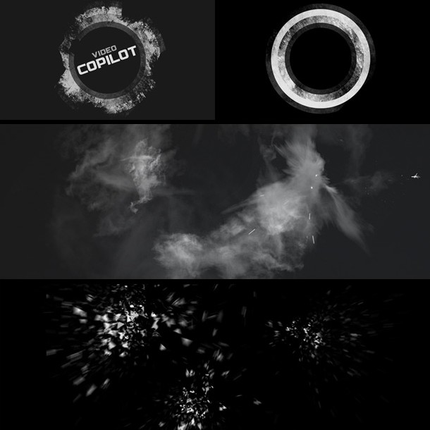
我做了一些简单的形状和徽标添加一个跟踪蒙板使它复古。我给不同环以不同部分的贴图给它变化。然后最后我添加了一些色彩校正到顶部。曲线调整!
我使用的碎片的像素特效,然后添加了一些细节 2个烟火和碎片。
粒子爆炸:像素聚教程
原文如下
Sometimes I like to play around inside of After Effects to create the look of a design even if it is a still image.In this design I used some techniques from a couple of previous tutorials to build a complicated looking badge that is actually pretty simple. Then once I’m happy with the “look” of the design, I try to figure out how to animate it on. I find that After Effects is more flexible and non-destructive than Photoshop so I can design freely. This is also why it is better to start by designing the look first, instead of worrying about how the effects are going to animate on. In this case, because of the shatter effects the flying pieces only look right on frame 3 but I’ll worry about that problem later!
I made the logo with some simple shapes and added a track matte to give it some grunge. I used different parts of the texture for each ring to give it variation. Then finally I added some Color Correction to the top. Go Curves!
For the debris I used the Pixel Poly effect, then added some Action Essentials 2 smoke and debris bits.
Particle Explosion: Pixel Poly Tutorial


